A stress-free method to fly with your pet
*A conceptual design by fellow a dog lover
What is Fur Flights?
Fur flights is a concept for a booking platform specializing in pet travel.
They only allow flight booking at this time as they work on expanding their platform and connections. I have been tasked to create a responsive website for different screen sizes. Fur Flights is waiting for more growth before they decide to allocate more of its budget to create a dedicated application.
-
UX Designer
UI Designer
User Researcher
Graphic Designer
-
4 Weeks
-
Figma
Adobe Illustrator
Whimsical
-
Research
Competitive Analysis
Survey
Interviews
Persona
Define
Feature Set
Sitemap
User Flow
Design
Sketches
Wireframes
Hi-Fi Screens
Test & Iteration
Prototyping
Usability Test
Problem
Have you ever thought about traveling with your pet but weren’t sure where to start? Many others have been in this same scenario, myself included. Traveling with a pet seems very complicated and intimidating. Fur Flights wants to change that and create an easy method for people to book flights with their pets.
Challenges
Due to time constraints, I was unsure of how many research participants I could find with pet flight experience. This indeed was a problem, but I was able to gather very useful data from users who have thought about pet travel and I was able to understand their concerns.
Goal
My main goals for this project are to understand how to make flight booking with your pet as easy as possible while also creating a responsive design for different devices.
Research
🔍
Research 🔍
Objective
I want to discover what devices users are generally using to search for flights. I also want to find out what users like and dislike about the sites that they currently use. This includes understanding their flight search process from start to finish. This will help me design a site that feels familiar as well as avoid the frustrations that users encounter.
Methodology
Competitive Analysis | User Surveys | 1-on-1 Interviews
Who’s the competition?
I started my research journey by comparing Fur Flights with direct competitors, as well as indirect competitors.
Direct Competitors
These companies were considered direct competitors due to the fact that they offer similar services as Fur Flights. These products accumulate rates from different airlines and feeds them to the users in an easily consumable method.
Indirect Competitors
These companies were considered indirect competitors to Fur Flights. The sites mainly show users flights only from their respective companies. Fur Flights offers users a wide array of providers to choose from.
Time to gather some info.
I created a brief survey to gather general information from potential users. The survey consisted of mainly multiple choice questions and was able to be completed remotely. This survey was also used to find potential 1-on-1 interview participants.
I wanted to discover what device potential users would be using while visiting Fur Flights. I was surprised to find that most users use a desktop or laptop when initially browsing. This informs me that when designing, I should prioritize a strong desktop view.
The results of this question did not come as much of a surprise, but more so a confirmation. When designing the home page, I should consider discount promotions as well as others.
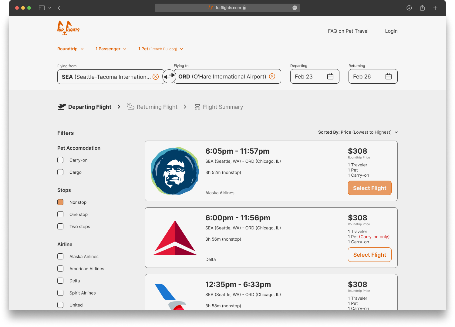
These results are in line with what I assumed when forming the question, but it is nice to have the reassurance. The design should default to sorting by price, with an easy option to sort by duration.
I was surprised at the number of results for Google Flights. Google Flights does not offer much in terms of content but get straight to the point. I would like to dive deeper into the reasoning for why their product is preferred.
The results of this question did not come as much of a surprise, but more so a confirmation. When designing the home page, I should consider discount promotions as well as others.
Let’s dive deeper…
I conducted 1-on-1 interviews with five potential users. All interviewees were pre-screened to ensure they have a pet and have taken a flight before. The majority of the users had also previously participated in the survey.
When I posed the question of what features users liked from other sites, almost all of them responded with interactive calendars. This feature shows users the lowers price for each date on the calendar. This is a feature that I would like to add after the MVP.
When I asked users if they have considered flying with their pets, only 60% responded with yes. There were different reasons that each user had given.
Most of the users voiced that they felt intimidated by flying with their pets. This was due to concerns with their pets, as well as simply not knowing the steps that need to be taken to travel with their pets. It is Fur Flights’ goal to bridge this gap.
Who are we designing for?
Using my survey results as well as the information gathered from the 1-on-1 interviews, I was able to create a persona for a potential user. This will allow me to design with a demographic in mind.
Meet Jordan Peterson
Developing a persona allows me to further understand users’ patterns, frustrations, and concerns. This allows me to design with empathy toward the user of the product.
Define
✍️
Define ✍️
What needs to be added?
It was now time to develop a list of features for Fur Flights. Although some of these features came directly from Fur Flights, the majority of the features are from accumulating all of my research data thus far.
Developing a sitemap.
Since the service that Fur Flights offers is extensive, I thought I should develop a sitemap. This would help me design with a purpose while simultaneously keeping the design organized and well thought out.
What route will people take?
There may be users who frequent Fur Flights’ website as well as first-time visitors. Their paths while navigating the site may be different, and I wanted to take into account all user types. Developing a user flow would assist me when making design decisions. This allowed me to understand the different paths that users may encounter while using the service.
Design
✏️
Design ✏️
Time to doodle!
I started my journey by producing low-fidelity sketches on an iPad. I like using an iPad as my medium because it allows me to correct small errors easily. It also allows me to have a more realistic feel for how the wireframes will come out.
Landing page options
Search results page options
Checkout page options
Bringing things to life.
After the initial sketches were created, it was time to get the framework set. I created mid-fidelity wireframes to get a feel for how all of the information on the site would flow. The wireframes were essential in my process because I am creating this product from scratch.
Landing Page
Search Results Page
Checkout Page
Second coat of polish.
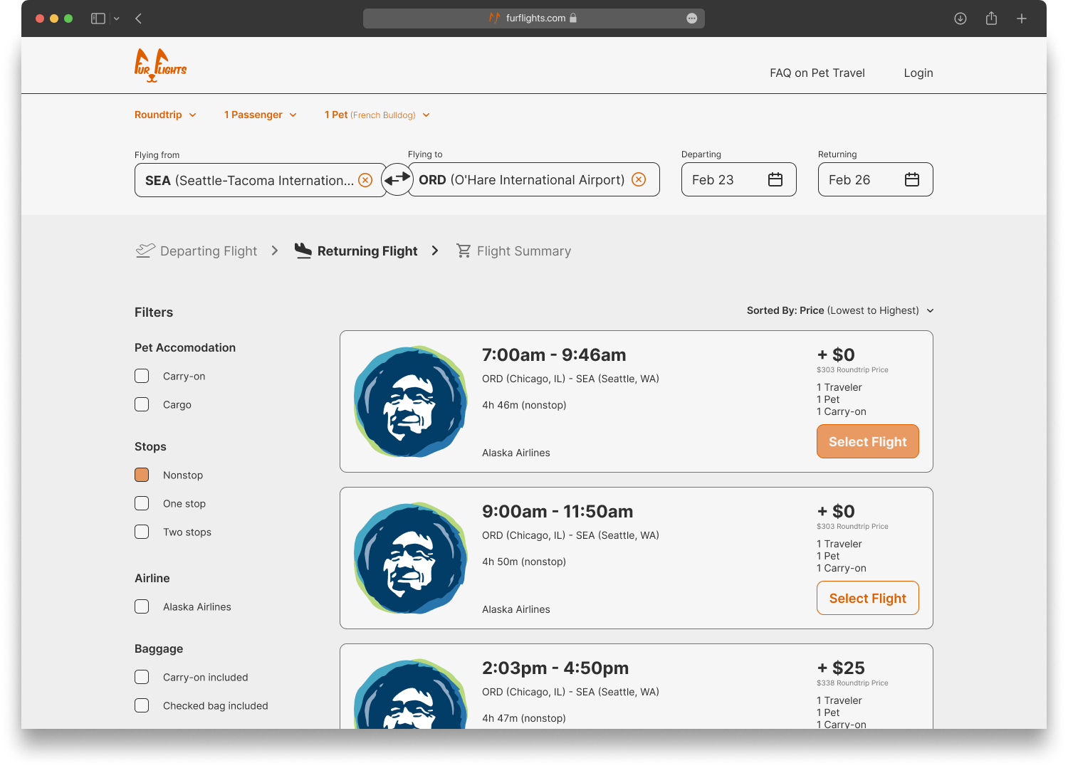
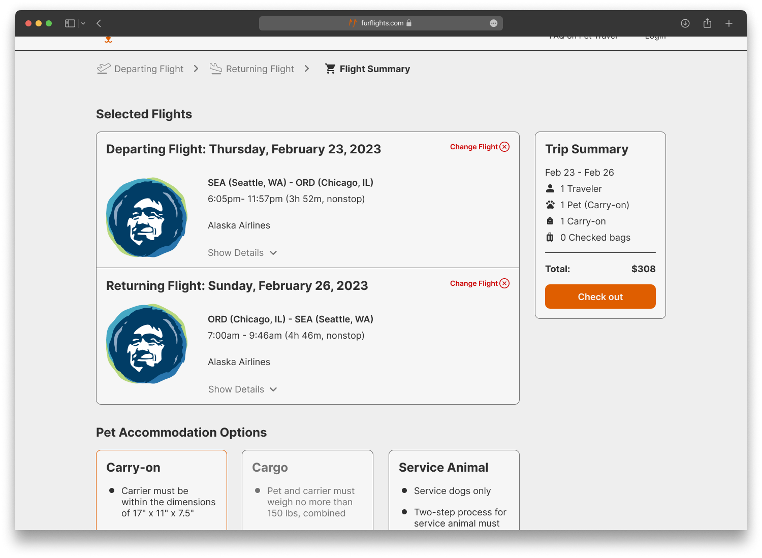
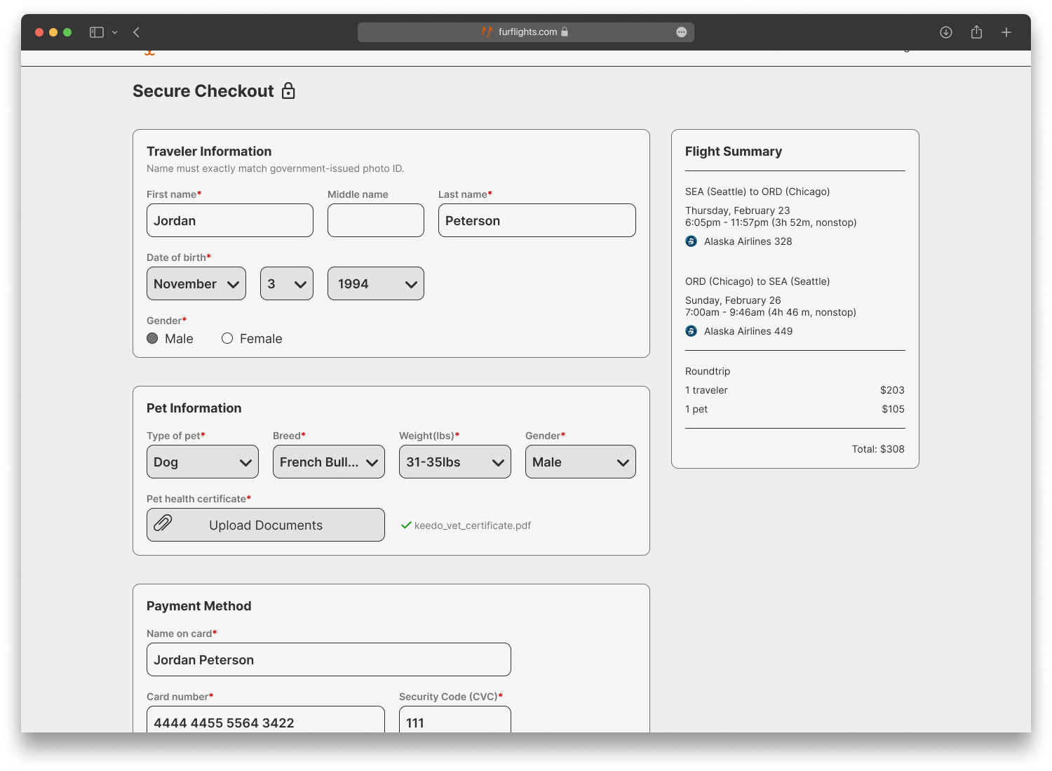
Once the mid-fidelity wireframes were finalized, it was time to start bringing the design to life. I created high-fidelity desktop screens based on the sketches and mid-fidelity wireframes. Once the desktop screens were finished, I created breakpoints to have the design responsive for mobile viewing.
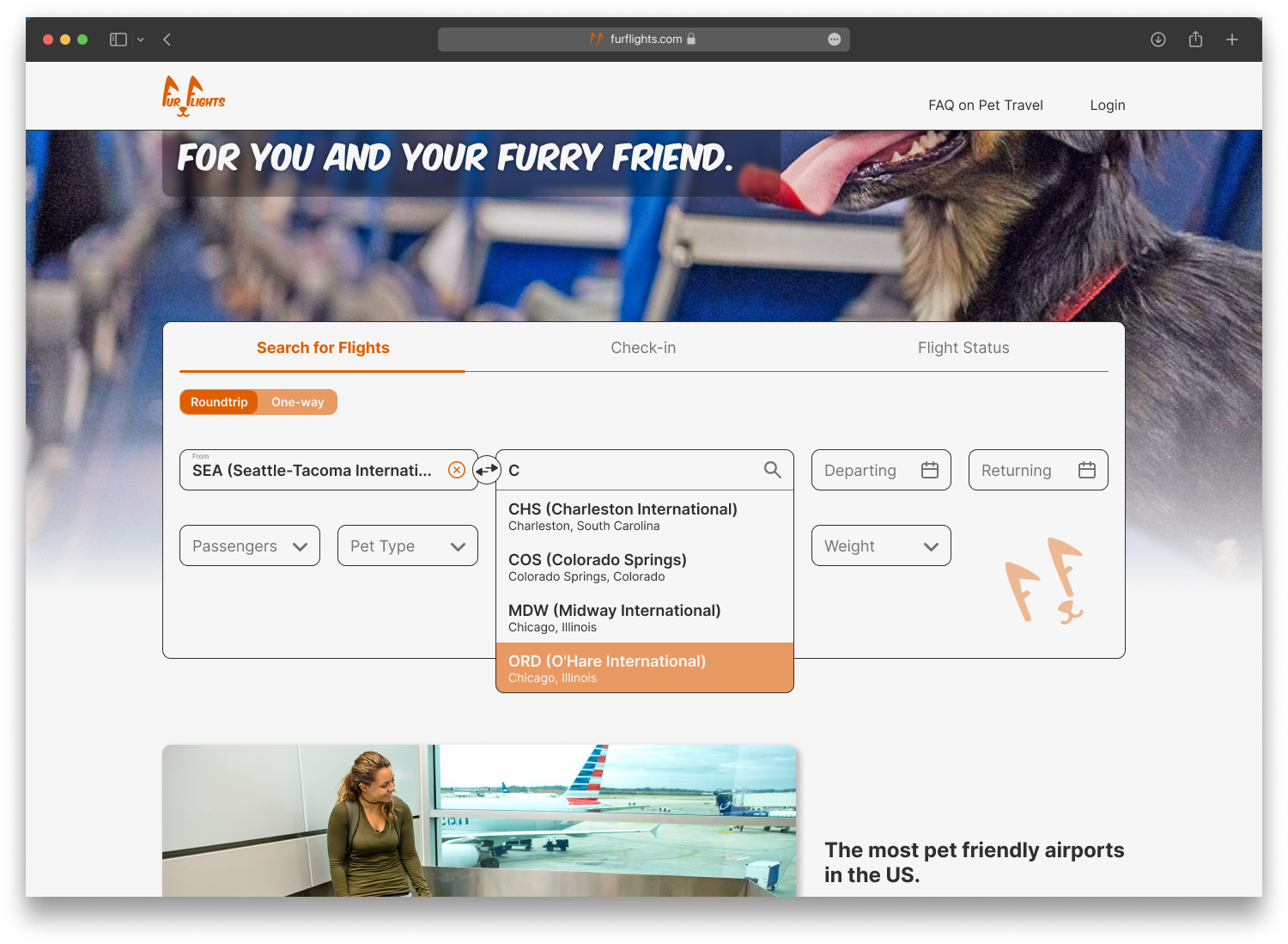
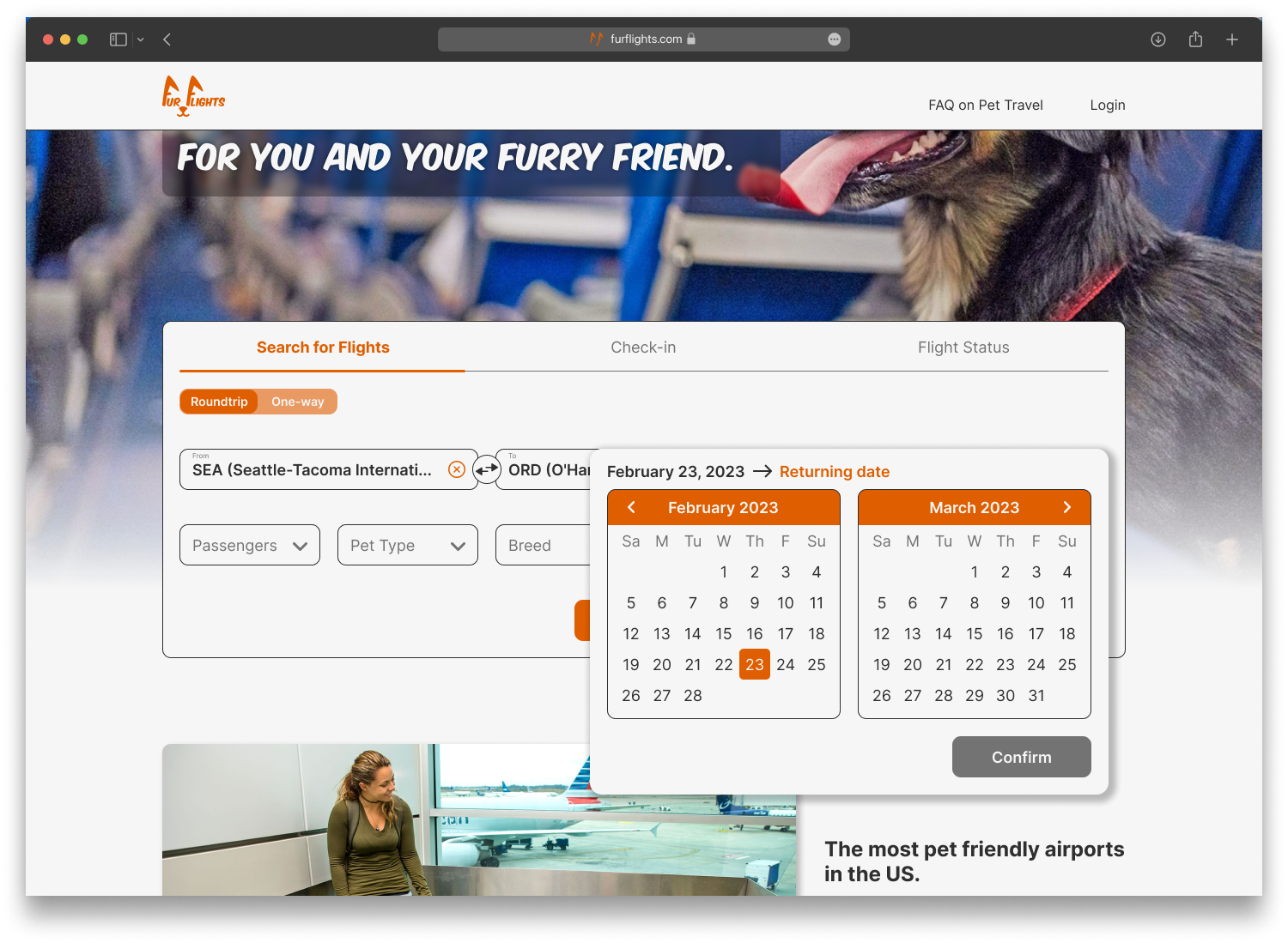
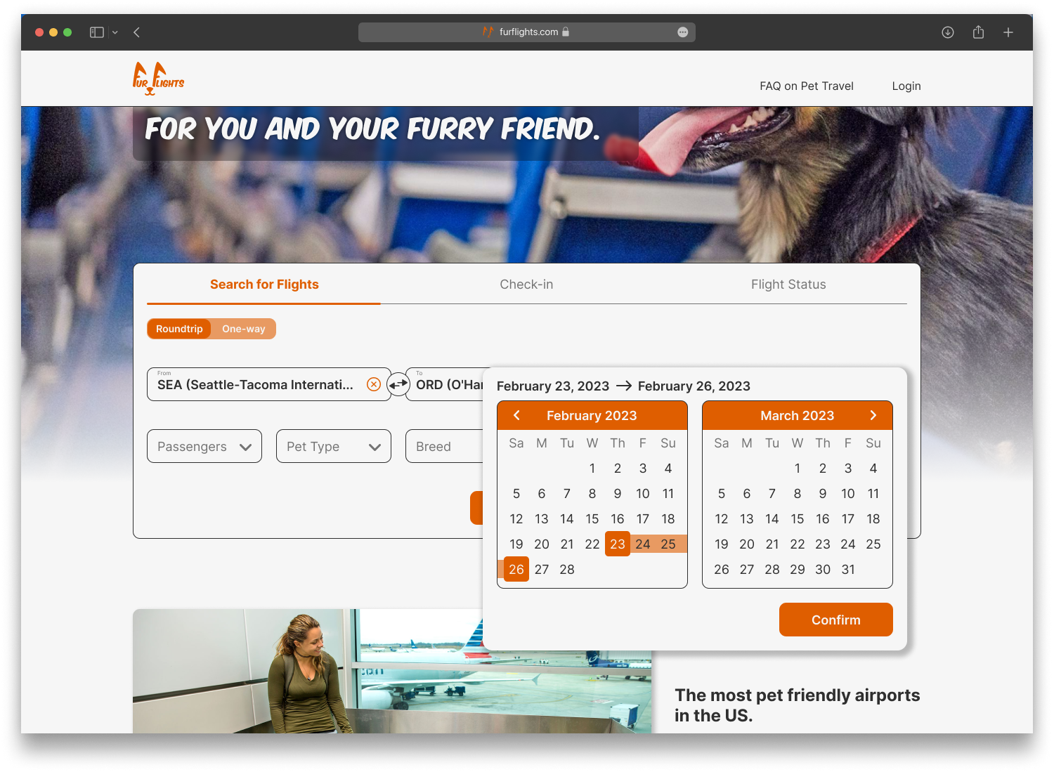
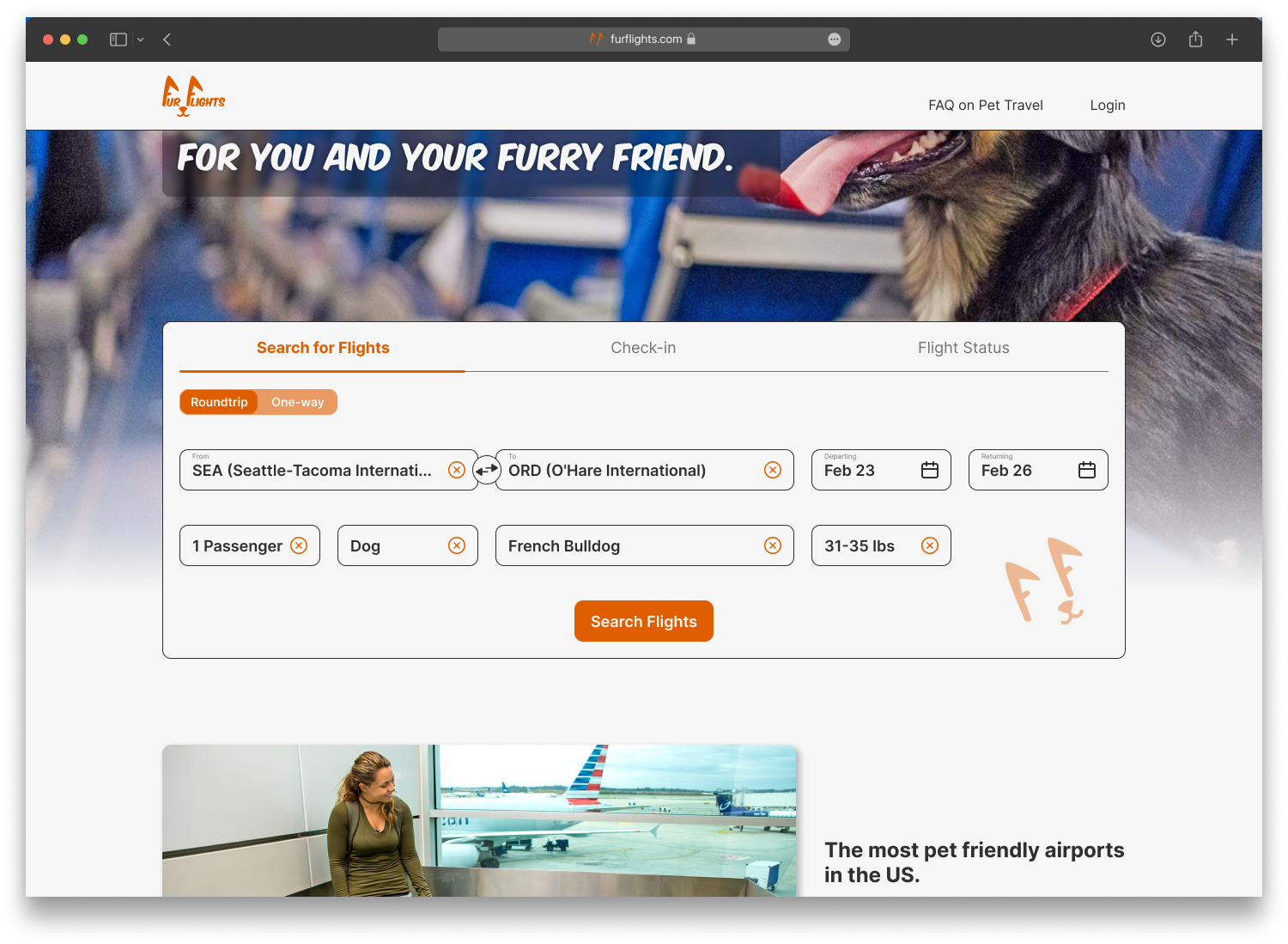
Desktop High Fidelity Screens
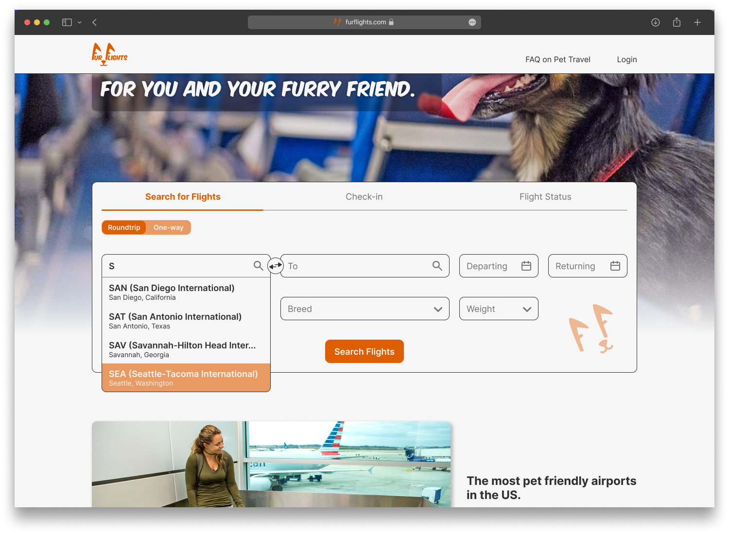
Landing Page
Search Results Screen
Returning Flights Screen
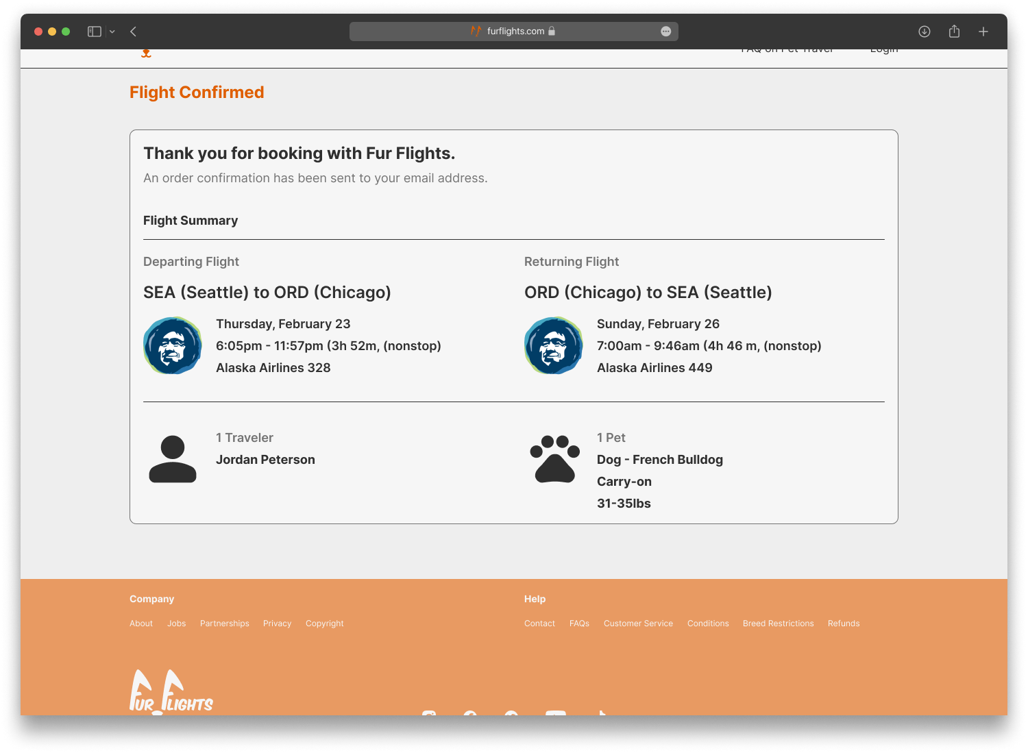
Trip Summary Screen
Secure Checkout Screen
Landing Page with Check-in Overlay
Checked-in Overlay
Mobile High Fidelity Screens
Landing Page
Search Results Screen
Returning Flights Screen
Trip Summary Screen
Secure Checkout Screen
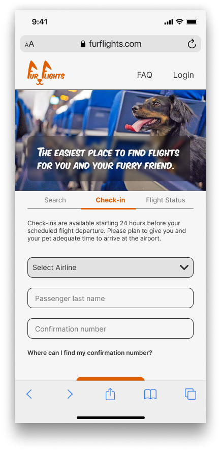
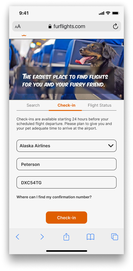
Check-in Overlay
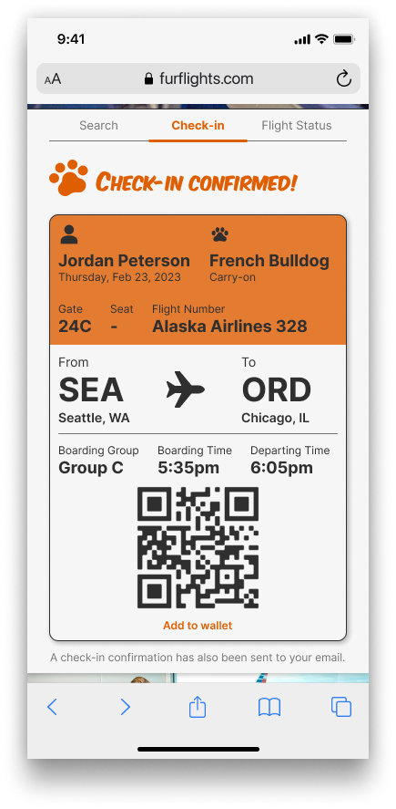
Checked-in Overlay
Mobile High Fidelity Screens (Full Page)
Test & Iteration
🧪
Test & Iteration 🧪
It’s alive!
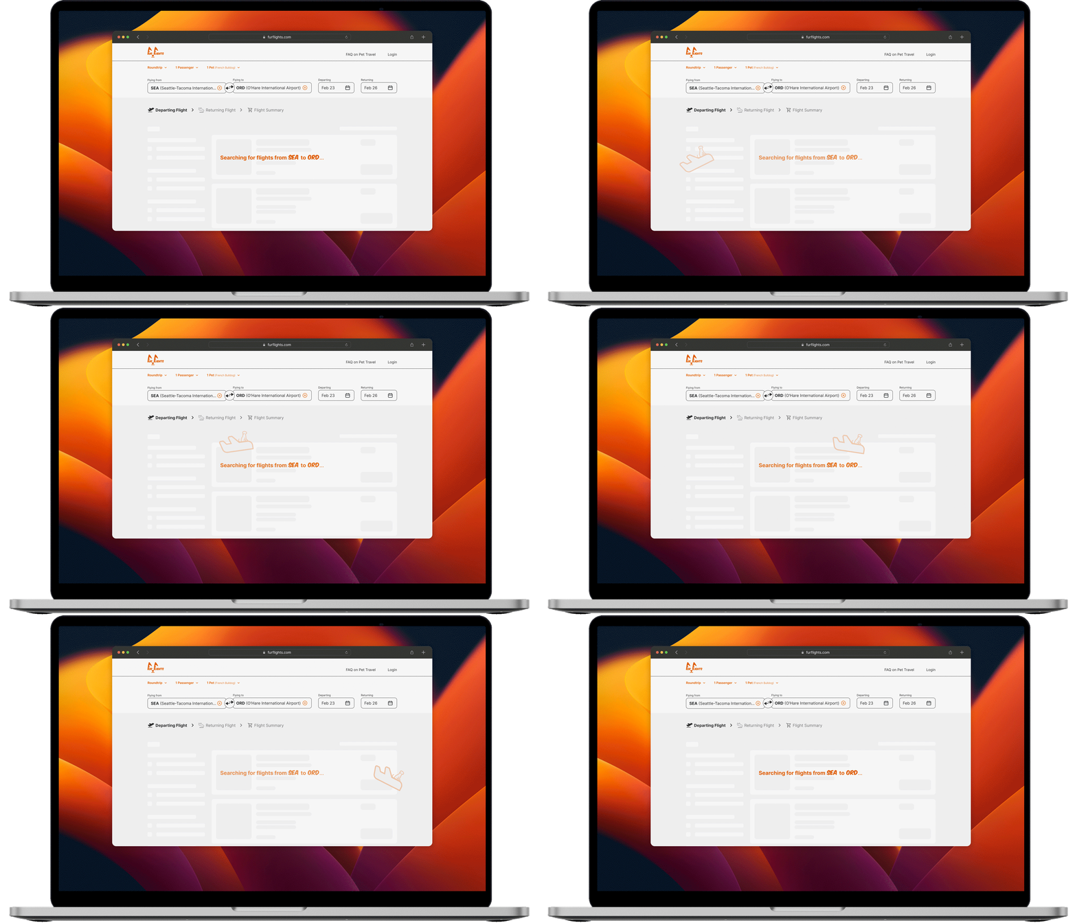
I decided to create the first interactive prototype on desktop view. This prototype was for the search and booking process. I chose this route based on the results of my survey during the research phase. To recall the results, 80% of the survey participants stated they used a desktop or laptop while searching for flights.
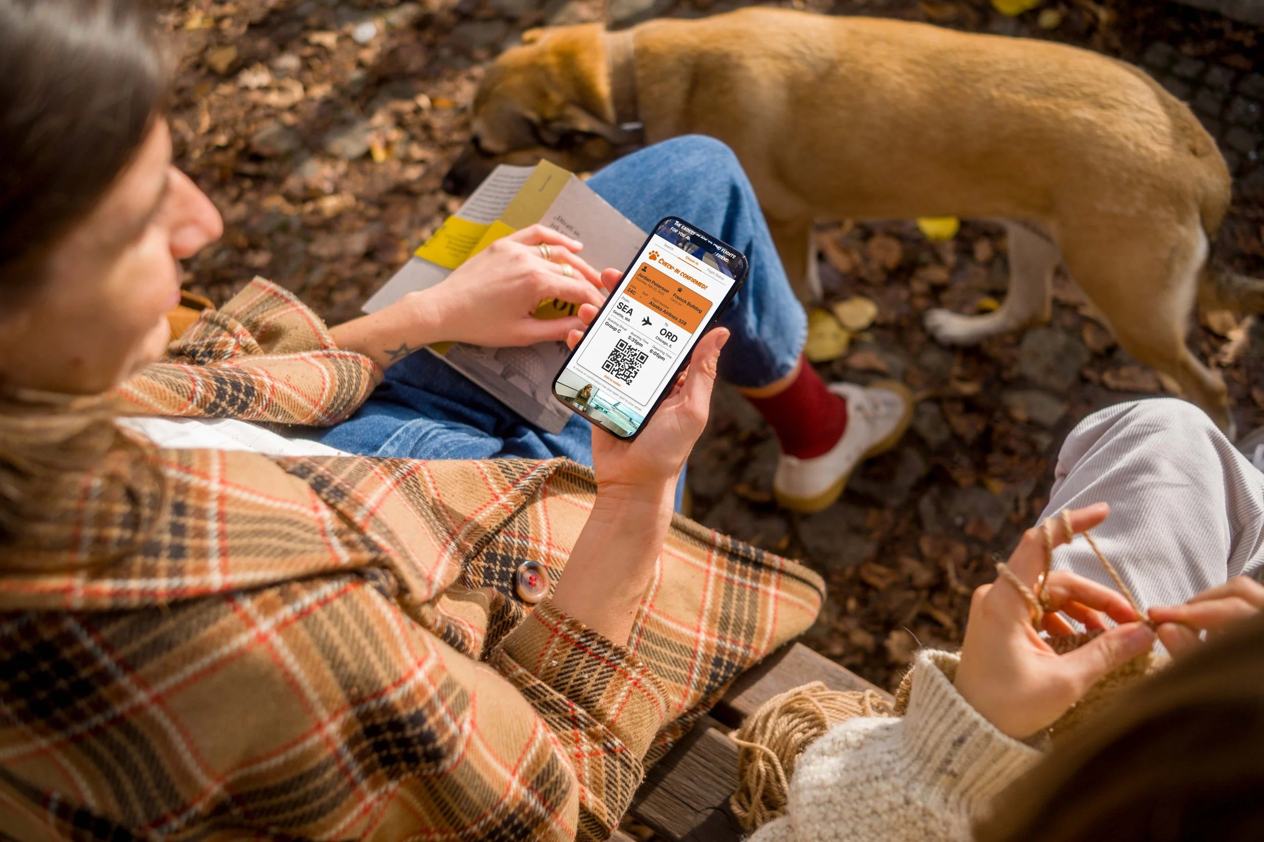
The second part of my prototype was for the check-in process. I created this prototype for mobile view since users frequently add their boarding passes to their mobile wallets for easy access.
Let’s run some tests.
I recruited 5 participants for my usability test. All of the participants met the prerequisite of booking a flight in the past. They were all tasked with completing a usability test for searching and booking a flight, as well as checking in for the flight.
All participants completed the booking test without any major hiccups. The only things worth noting were:
Participant 2 asked why “non-stop” flights were automatically applied.
Participant 5 stated that the filters all seemed to blend into each other.
These are both very minor issues and do not affect the MVP.
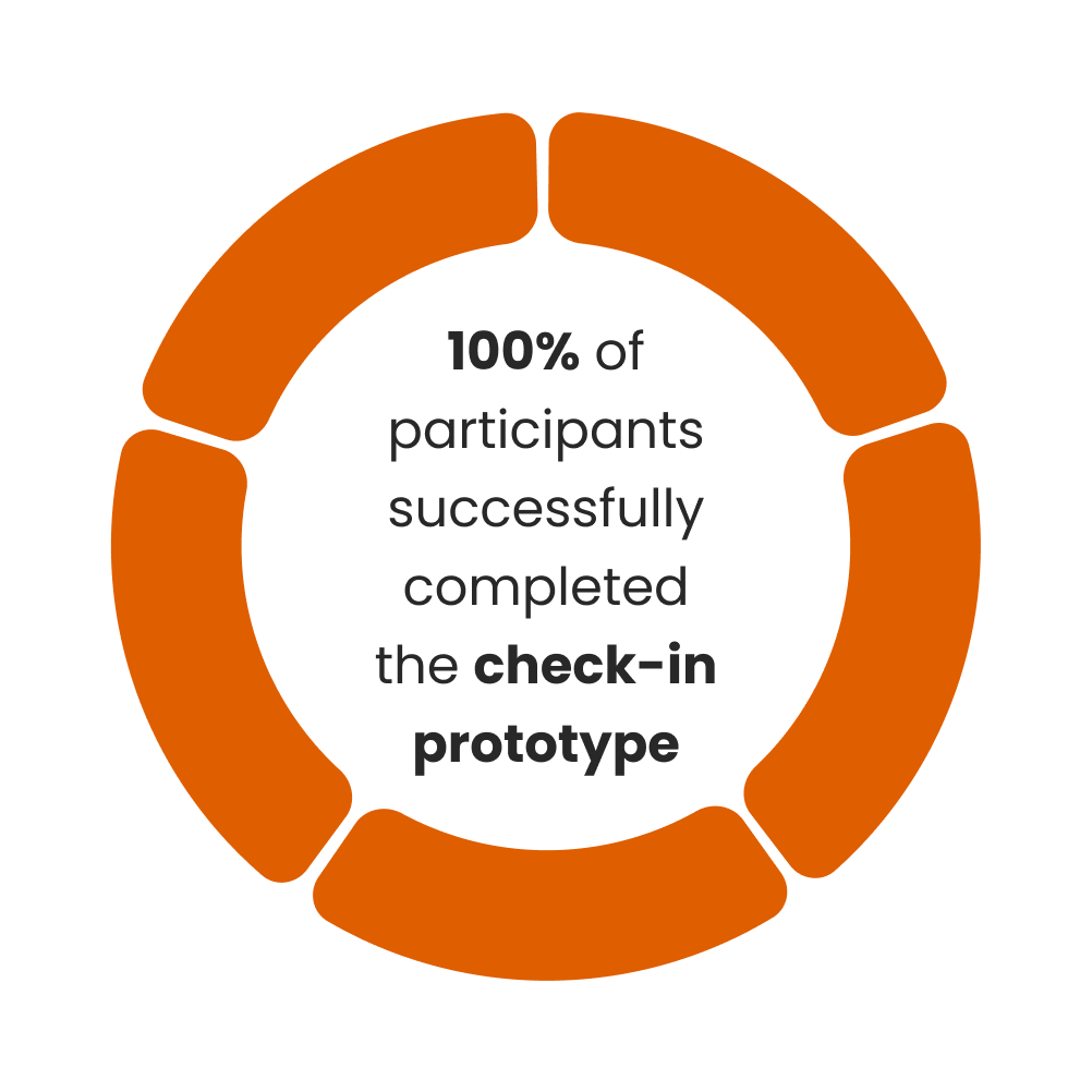
All participants successfully completed the check-in test without any issues. All participants stated that the prototype was very straightforward.
Desktop Search and Booking Prototype
Mobile Check-in Prototype
Where to now?
With this being a conceptual design, the possibilities are endless. I would like to create an app for Fur Flights next. This would allow for more micro-interactions between the product and the user, which I love creating. I always enjoy being able to bring products to life with animations and interactions.

