Creating a new experience for travelers
*A Passion Project by a fellow music lover
What is Uber +Music?
Uber +Music is a new way for users to experience ride-sharing. Spotify, an audio streaming service, distributed 10,000 of their Car Things to eligible Uber drivers. The drivers had to exceed certain rating criteria as well as have an eligible vehicle. I was tasked with adding a Spotify overlay into the existing Uber app for users who wanted to use the service.
-
UX Designer
UI Designer
User Researcher
-
4 Weeks
-
Figma
Adobe Illustrator
Adobe Photoshop
Whimsical
-
Research
Interviews
Persona
Primary Research
Define
Feature Set
User Flow
Design
Sketches
Hi-Fi Screens
Test & Iteration
Prototyping
Usability Testing
Problem
Have you ever taken a ride share where the driver is playing, what you consider, terrible music? I for sure have. This is a huge inconvenience for me, and I discovered that it’s an issue for many others as well. Of course, you can always ask them to play something else, but I always felt like that would be rude of me so I never have. Sure, you could use headphones, but what if you forgot to bring them? I wanted to come up with a solution for these scenarios, which is where the idea of Uber +Music was created.
Challenges
There are a few design challenges that I anticipated I would run into throughout the process. My main concern was trying to Maintain both Uber and Spotify’s brand identity while merging the two interfaces into one platform. I also wanted to make sure that the integration would be easy to use as well as aesthetically pleasing.
Goal
My main goals for this project are to confirm the need for such an idea and integrate the two platforms as seamlessly as possible.
Research
🔍
Research 🔍
Objective
I want to learn how users currently interact with ride-sharing services as well as how they tackle the task of requesting specific music to be played. I also want to confirm my hypothesis that users would benefit from an easy way to play music while using Uber.
Methodology
I conducted five 1-on-1 interviews with people between the ages of 20 and 30. All interviewees were pre-screened to ensure that they have used a ride-sharing service in the past as well as being individuals who enjoy music.
What did we uncover?
The interview script had no reference for what ride-share platform this feature would be added to. When asked what ride-share platform the interviewee preferred, all of them responded with Uber. This helped me further believe that Uber would be the right candidate to introduce this service to.
“I guess Uber just feels like the Apple of ride sharing to me.”
When I would personally take rides with Uber, occasionally the drivers would ask me if there was anything that I would like them to play. I was curious if this only happened to me, or if it was a common reoccurrence. I discovered that other users encountered the same thing during their trips.
“I hate it when I get into an Uber and realize my headphones are dead.”
Although the drivers would ask me if I would like anything to be played, I would never accept their offer. It always felt strange to me. I was unsure if that was because of how I am as a person, or if there was a greater factor coming into play. I discovered that I was not alone in this and it was quite uncommon for people to ask the driver to play something specific.
“It just feels so awkward to take over someone else’s car. What if it’s an old lady and I want to play some rap?”
Who would this be designed for?
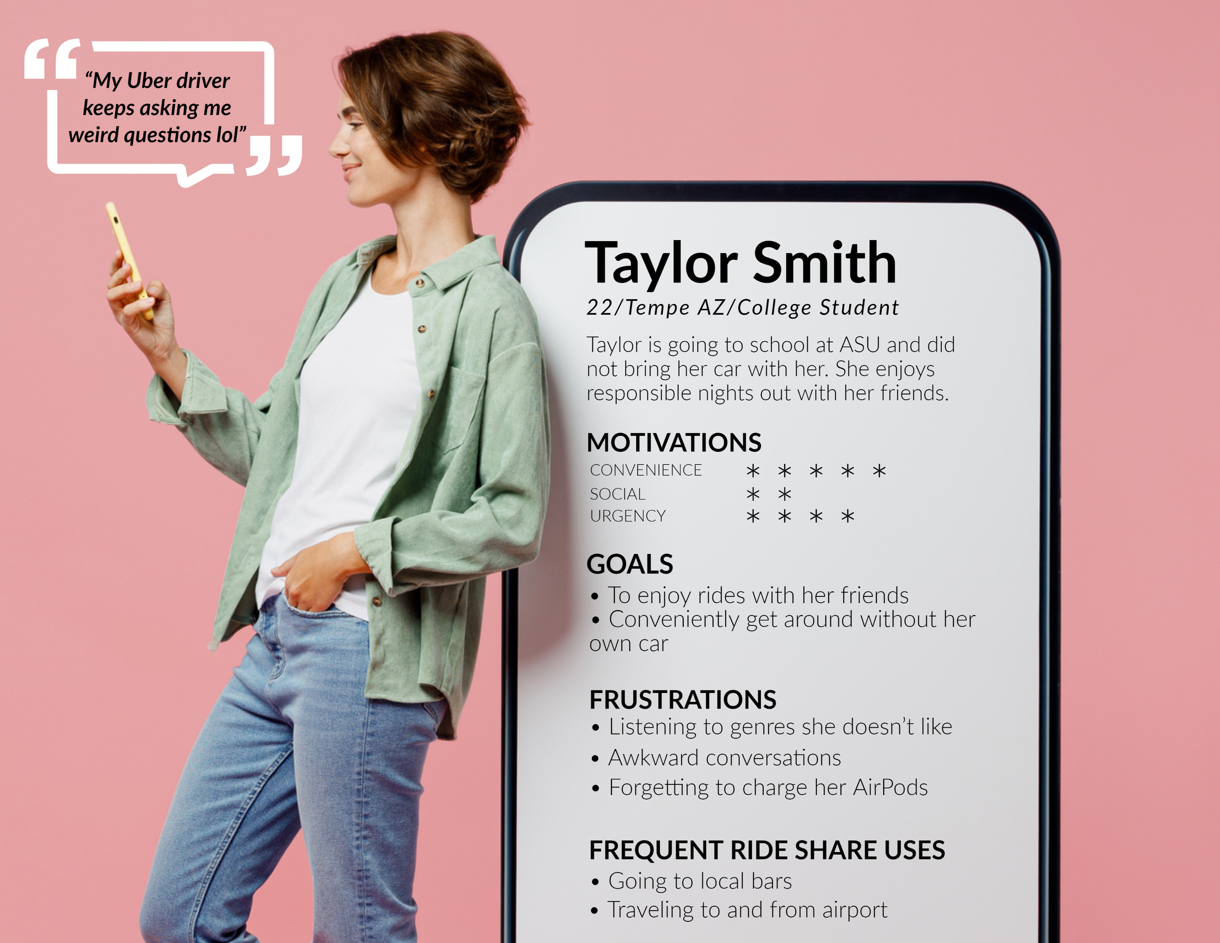
Using my research findings from the 1-on-1 user interviews, I created Taylor Smith to empathize with the average Uber user. I will be able to design the product in a manner that would appeal to the average target user. Developing this persona also allows me to further understand users’ behaviors, motivations, and pain points.
Coloring within the lines.
I gathered Uber and Spotify’s brand guidelines to keep brand integrity. I wanted to ensure that my product would follow their current standards on all of my high-fidelity screens and prototypes. I needed to make sure that the experience felt natural to what current users are used to navigating.
Define
✍️
Define ✍️
Features (feat. Uber +Music)
Utilizing my research findings as well as the user interviews, I developed a feature roadmap for the Uber +Music Integration.
Goin’ with the flow.
With all of the information I have gathered thus far, it was time to develop an ideal user flow. The goal behind this flow chart was to understand where and how I can integrate Spotify into Uber’s current platform. I needed to be sure not to interrupt the current user journey, but also be able to mesh Spotify into their service.
V.1
This is the original user flow that I created. This flow shows the Spotify login screen immediately after selecting Uber +Music. This flow is not ideal. Users may be in a rush and become frustrated when prompted with extra screens before confirming their ride.
V.2
This flow allows for a more interruption-free experience. Users can use the Uber app more smoothly without experiencing any unusual frustrations. This flow is ultimately what the final design was based upon.
Design
✏️
Design ✏️
Time to get some pen to paper.
I started my journey by producing low-fidelity sketches on an iPad. These sketches consist of key screens as well as secondary screens based on Uber and Spotify’s current user interfaces. A majority of these screens helped create the final product.
Main Navigation Screens
Login/Sign up Screens
Spotify Integration Screens
Let’s get some make-up on.
Once the initial low-fidelity sketches were sufficient, it was time to produce high-fidelity screens. These screens will be used to build a working prototype with potential future users.
Test & Iteration
🧪
Test & Iteration 🧪
Getting active!
I wanted to make sure that the prototype I produced was fluid and familiar with both Uber and Spotify’s current user interfaces. I wanted the prototype to feel natural for users during my testing. The way I achieved this was by following the respective apps’ current interactions.
The participants for the prototype test had to have used the Uber app previously, but not necessarily Spotify. The reasoning behind this was to test and make sure that their normal Uber journey felt uninterrupted with the integration of Spotify into the platform.
The tasks that I had the participants complete were to:
Select and request an Uber +Music ride
Log in to Spotify
View the driver’s library
Queue the song that is favorited from the driver’s library
View the song queue list
Let’s find some test subjects.
I recruited 5 participants for my usability test. All of the participants met my prerequisite of using the Uber app in the past.
Time to see if anything is wrong.
I recruited 5 participants for my usability test. All of the participants met my prerequisite of using the Uber app in the past.
One participant had trouble opening the Spotify overlay. The original design only had a bar near the top of the “now playing” chute. This bar was meant to indicate that it could be interacted with. It took a few different actions, but eventually, the participant figured it out. They even tried tapping the overlay to expand it.
Once they completed the test, I circled back to that inconvenient interaction. The participant stated that they were used to overlays expanding with taps on chutes. I considered this and revised the design accordingly. The new design allows users to either swipe or tap to expand the chute.
The original design strictly had an “add to queue” button next to the favorite icon. I chose this route to try and assist users with a fast way of queuing songs rather than expanding a menu to access the “add to queue” selection.
During my usability testing, I discovered that another iteration needed to be made. This discovery was based on users who were familiar with Spotify and their swipe shortcuts. 3 out of the 5 participants tried to swipe to queue the song. This is Spotify’s way of streamlining its user interface, so I added that feature to the final design as well.
The Uber +Music experience.
Based on the results of the usability test, I revised the Uber +Music prototype. There were also some design flaws that I had noticed that needed to be corrected before the handoff.
What’s next in the queue?
I think that a driver UI would be fun to produce next for this project. It would be nice to be able to see the differences between the interfaces as a consumer and the backend. The driver’s UI would house their selected songs as well as show what the passenger may have queued in their playlist. There would be different design problems that I would need to overcome since the two interfaces are completely different from each other.

